The IAEE Art of the Show Competition’s Show Brand Design/Development category evaluates visual and messaging components used to build a new show’s brand or rebrand a show that was already in existence. Judges take into consideration all the separate elements of the marketing campaign to determine how well they leave a lasting impression on the target audience, and if they are effective in creating a brand association with the show.
Judging criteria includes: originality, visual appeal and creativity of the show logo and/or “theme” material; how effectively the individual marketing elements connect with the overall show brand; ease with which the audience correlates the branding back to the show; how well the branding speaks to the experiential value attendees can expect from the show; and how well each branding effort meets its marketing objectives.
In today’s IAEE Blog, we highlight the winners of last year’s Show Brand Design/Development category:
Under 75,000 nsf
Ontario Hospital Association
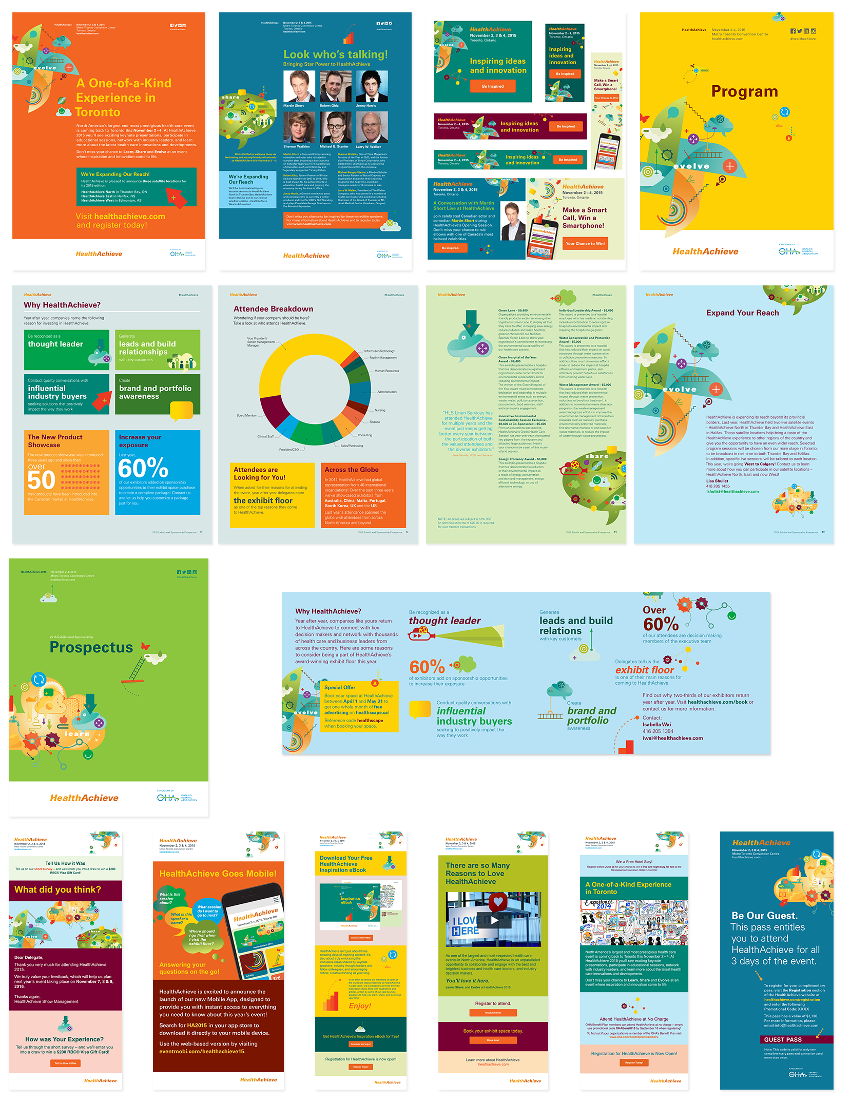
HealthAchieve

The signature conference and exhibition of the Ontario Hospital Association (OHA) for over 90 years, HealthAchieve is an award-winning event that has long been one of the largest and most respected health care events in North America – the preeminent gathering place for health care and business leaders. HealthAchieve continues to inspire ideas and innovation by providing global health care and business leaders with an unparalleled opportunity to learn from each other, share their ideas and evolve their perspectives.
The event targets two distinct audiences: prospective attendees and potential exhibitors. The prospective attendees are made up of international health care and business leaders. The potential exhibitors are made up of medical suppliers and commercial vendors from across the globe. HealthAchieve provides the platform for unlimited networking opportunities between the two distinct audiences, and would not be the distinguished event that it is without ample participation from both.
The 2015 HealthAchieve brand focused on the key elements/reasons for attending the event: to “learn” from peers, “share” ideas and “evolve” perspectives. As an annual event, the HealthAchieve brand needs to differentiate itself from the previous year. To do this, OHA developed a different look and feel of the event through the use of subtly different color palettes. Building off the 2014 event, HealthAchieve 2015 introduced an array of lighter, more pastel versions of the 2014 color palette.
To ensure brand consistently over the years, HealthAchieve repeats graphic elements – most notably its “learn”, “share” and “evolve” icons – keeping with its theme and message that HealthAchieve exists to inspire ideas and innovation. The goal of HealthAchieve’s brand design and development campaign was to secure returning and new attendees. Its objective was to develop a collection of marketing materials that resonated with previous attendees familiar with the event and HealthAchieve brand, and capture the attention of new attendees who may not have heard of HealthAchieve. The show’s brand consistency and recognition with attendees helped it secure returning and new attendees.
Over 200,001 nsf
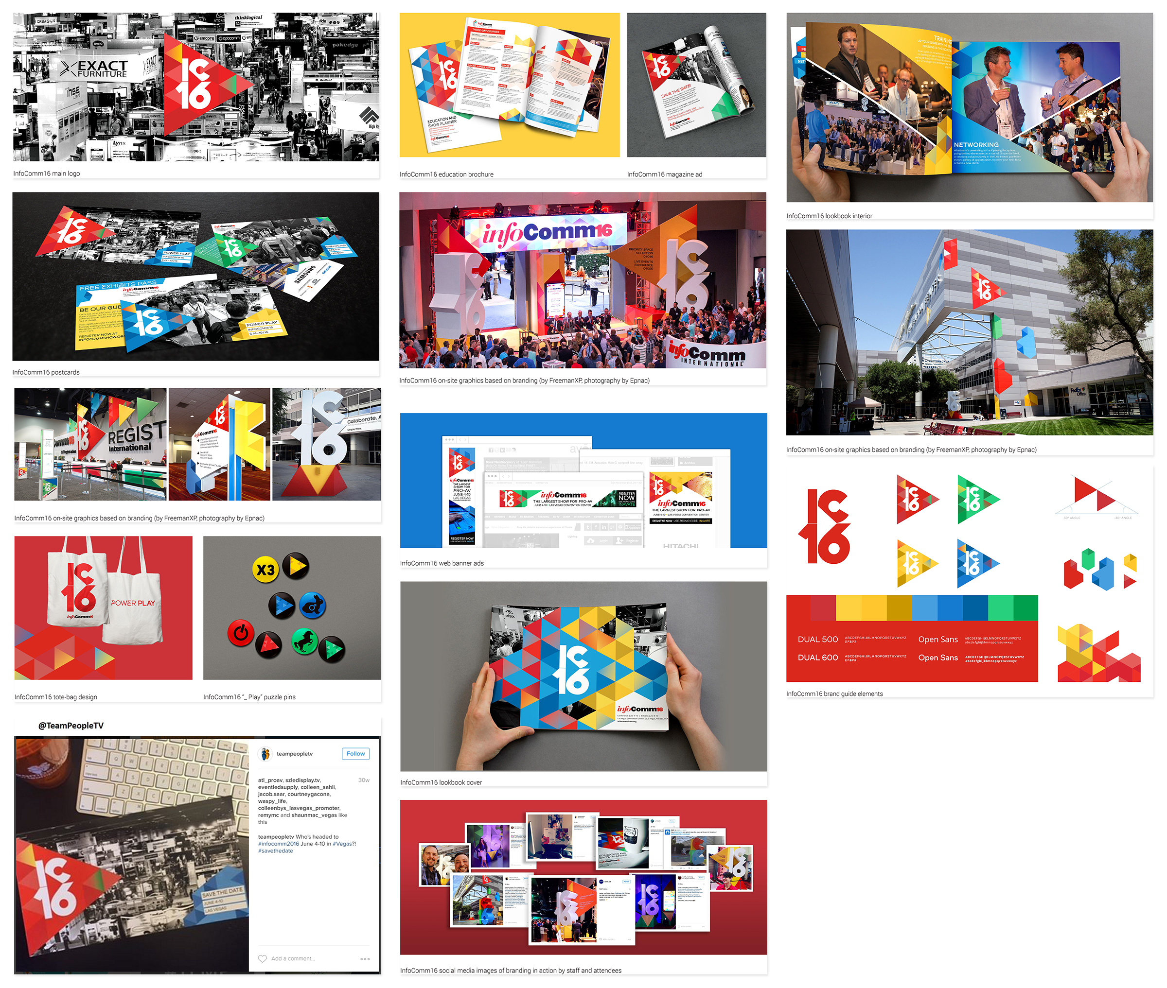
InfoComm 2016
InfoComm International & Works

InfoComm is the largest, most exciting event in the United States focused on the pro-AV industry, with nearly 1,000 exhibitors, thousands of products, and 40,000 attendees from 110+ countries. InfoComm offers attendees a once-a-year opportunity to see the latest audiovisual technology, learn the skills that will advance their careers, and grow their professional network.
The branding designed for the 2016 show was created to convey anticipation and excitement, since InfoComm is an event filled with innovative technology. Since attendees truly don’t know what they might see there, the branding campaign focused on the theme, “Press Play. Once you press play, you never know what lies ahead.”
The overall goal was to lay the groundwork for an exceptional experience; one that would set the proper tone for a tech conference of this scale and quality. Additionally, the goal was to create a branding system that could be utilized by the team that would be building the on-site dimensional materials.
With the potential for information overload, the team chose to simplify and then amplify – by drawing inspiration from the iconic “play” button and the universal primary colors found in A/V cables. They let the simplicity of the icon, and the boldness of colors and patterns build the story. By creating the “ic16” icon (an abbreviation for InfoComm16), they created intrigue around the brand for new comers, and a feeling of being “in the know” for long-time fans. A modular set of branding elements and patterns was also created to assist the team building the on-site materials. A system was designed to give them both the creative inspiration, and the rules to maintain consistency and a cohesive experience, without getting repetitive.
“We strive every year to be creative and present a fresh and fun approach to our show brand that captures the energy, excitement and exceptional experience of the professional audiovisual industry on display at our event,” said Jason McGraw, CTS®, CAE, Senior Vice President of Expositions, InfoComm International. “From the concept development with Works Progress Design to on-site implementation with Freeman and our terrific in-house marketing team, it’s rewarding to be recognized for everyone’s hard work.”
The 2017 IAEE Art of the Show Competition is now underway – you have until 31 August 2017 to submit your entries! You can also view all of last year’s winners and honorable mentions here.

