The IAEE Art of the Show Competition’s Signage/Décor category evaluates printed and/or digital signage and décor used throughout the show. Judging criteria includes: overall presentation, visual appeal and creativity; usefulness of the signage and its content; how the signage/décor contributes to the overall “theme” of the event; and effectiveness of signage placement and décor throughout the show.
In today’s IAEE Blog, we highlight the winners of last year’s Signage/Décor category:
Under 75,000 nsf
FreemanXP – Tom Yurkin/Nora Summers
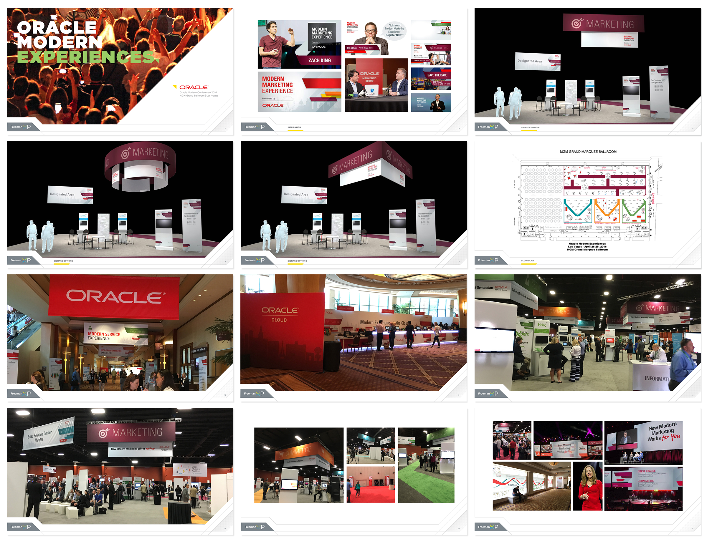
Oracle Modern Marketing Conference 2016
Leaders in customer service convened at Oracle Modern Marketing Conferences 2016 to participate in hands-on workshops, product demonstrations, and network during interactive breakouts that showcased best practices to help turn the attendee’s customers into brand advocates. For the signage and décor, multiple shows blended into one encompassing event that is attendee and message focused and environmentally conscious. Bold iconography and color palette were used to divide the space and direct attendees between the marketing, sales, commerce and service areas.
The goals and objectives for the signage and décor involved creating a clean, impactful, and reconfigurable suite of signage and registration elements that could be reused over multiple years and scalable for use within an array of venues. A cohesive look was created that reinforced Oracle’s modern brand. Sustainability was essential while incorporating Freeman rental elements like SmartPanels and Smart Counters. This also included using generic branded graphics that could be reused from year to year. In addition to the registration area and expo area, the look and feel was extended throughout the show experience.
Between 75,001 and 200,000 nsf
GES
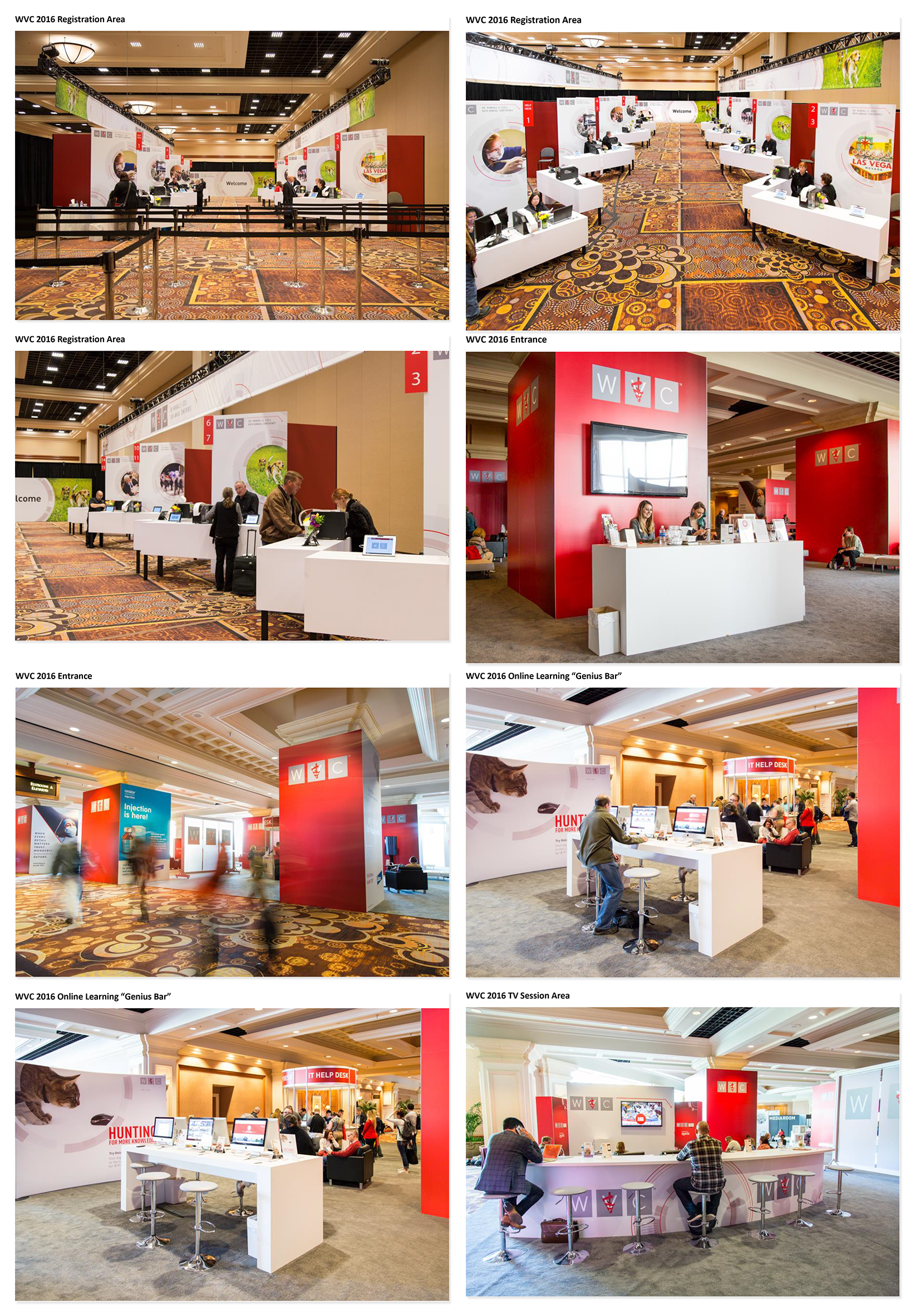
WVC 88th Annual Conference
Since 1928, the Western Veterinary Conference (WVC) has provided comprehensive, progressive and practical continuing education opportunities to veterinary professionals from all over the world. The WVC Annual Conference brings together the best and brightest veterinary professionals for five days, who learn from expert instructors and gain knowledge that they can return to their practice and put to use immediately. With more than 1,000 hours of CE available, the conference is an opportunity to earn all required CE in one place. Offered in a world-class destination that is also cost effective for travel and accommodation, 97% of last year’s attendees said they would recommend attending the conference to a colleague.
The offerings are delivered by WVC use state-of-the-art facilities, methods and technologies. GES partnered with WVC early in the event development cycle to leverage WVC’s existing brand, as well as expand upon it to reflect WVC’s advances in its core areas. Graphics were inspired by design elements found in touchscreen user interfaces, in combination with lifestyle and workplace images that reflected the broad range and scope of the products and services offered by WVC. The images and graphics selected were designed to appeal not only to longtime members of WVC, but also to capture the imagination of younger members who expect data products to be accessible and hands-on resources to reflect the cutting edge in the industry.
The Registration Area was innovative and inviting. The architecture consisted of sleek, kiosk style registration stations staffed by the WVC team. This innovative design challenged the more transactional “over the counter” approach used in most exhibition environments and resulted in a more engaging experience for attendees. Functionality was priority number one since the WVC Annual Conference is a large event. When the doors of the registration area swing open, a crush of eager attendees descends upon the area. Therefore, several functional requirements must be met in the WVC registration area. GES worked closely with WVC to understand its workflow and spent the time necessary in the discovery phase to ensure the designs addressed the show’s true requirements.
The entrance design drew guests in to the central hall area of the WVC booth and functioned as the “grand hallway.” The Online Learning “Genius Bar” became a gathering place where participants charged their devices,and networked with one another. . The Online Learning zone was designed to be inviting and to provide an area for guests to demo WVC’s online platform. The TV Session Area was also a gathering place where participants networked and viewed WVC sessions. Comfortable seating and a custom bar with charging stations encouraged participants to linger. The new design throughout the conference was embraced by the WVC and those attending the 88th Annual Conference.
First impressions are important. Upon entering the Registration, the Online Learning “Genius Bar” or the TV Session Area, guests were greeted with a cohesive, vibrant and informative environment. The architecture and graphics elegantly delivered the WVC message. Guest after guest expressed their delight with the registration area and so did WVC. But first impressions are not everything. If first impressions are important, functionality is essential. GES designed the registration navigation scheme by considering timing of each “event” (e.g. logging a visitor) down to the second in order to ensure a smooth traffic flow and easy navigation for participants. Broad, open navigation lanes were used and WVC concierges directed participants to the next available help desk rather than employing queues at each desk. The planning and collaboration between WVC and GES paid off and the registration process was seamless with thousands of guest moving through the area quickly.
Over 200,001 nsf
InfoComm International & Freeman
InfoComm 2016
InfoComm is the largest, most exciting event in the United States focused on the pro-AV industry, with nearly 1,000 exhibitors, thousands of products, and 40,000 attendees from 110+ countries. InfoComm offers attendees a once-a-year opportunity to see the latest audiovisual technology, learn the skills that will advance their careers, and grow their professional network.
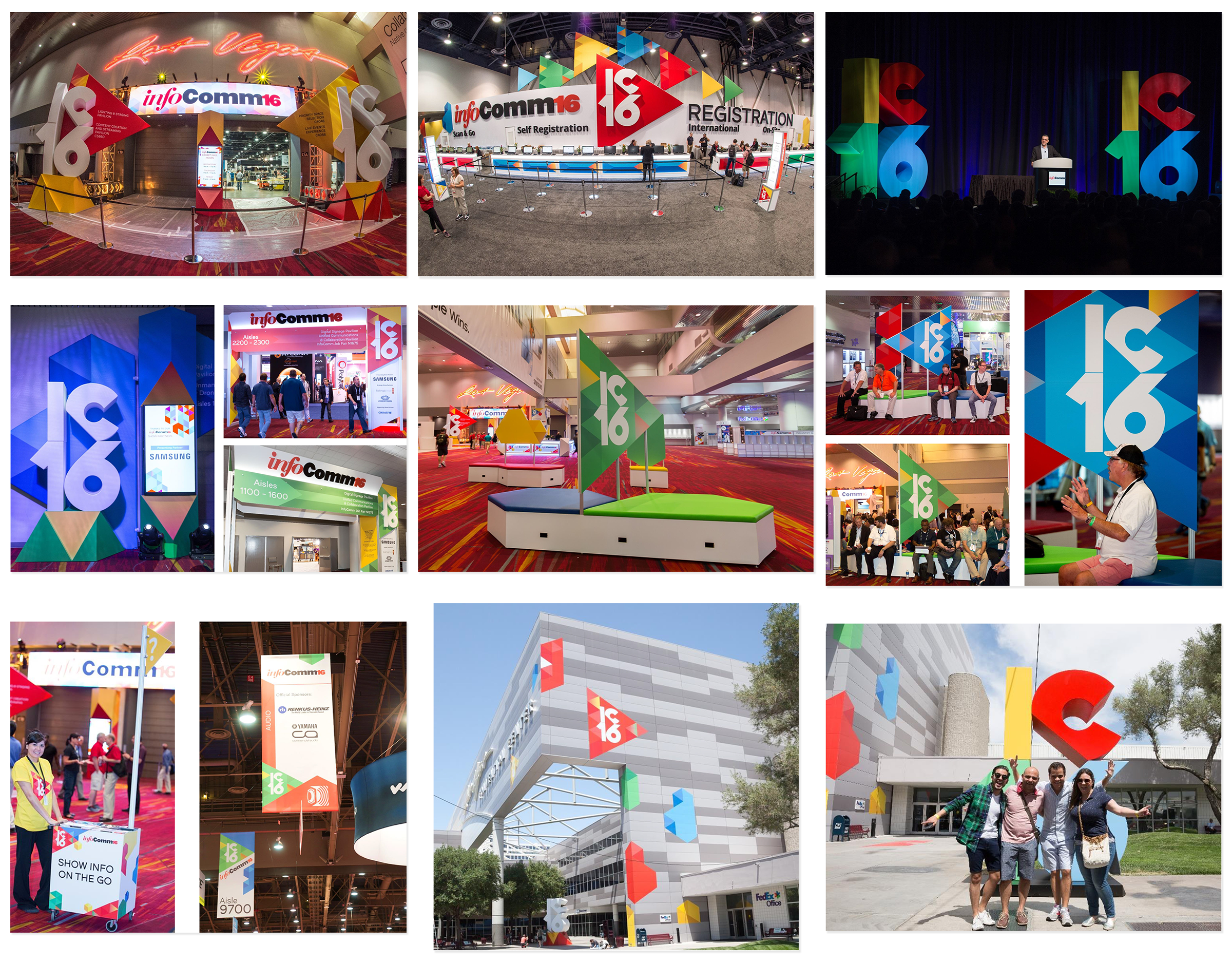
The “look and feel” for InfoComm 2016 was based on the concept of “play,” prominently featuring the triangle-shaped “play” button found on a variety of products in the audiovisual industry, like video cameras, DVD players, iPods, stereos, etc. The playful use of primary colors for the branding palette reinforced the “play” concept and also reflected the vibrancy of the audiovisual industry.
The goal for the décor and signage was to thoroughly integrate and reinforce the “play” concept throughout the show without being repetitive. The “play” triangle and abstract graphic shapes were configured into a variety of ways, in different scales (from an aisle banner to a meter board), and different colors were mixed and matched to add visual interest (for multiple entrance units).
From the impressively massive IC16 “play” button in the registration area to the small yellow “play” buttons on information carts, the brand concept was seen throughout the event and created a harmonious environment from the show floor, to the shuttle bus pickup area, to the convention center lobby. The abstract shapes could be configured in an exponential number of possible layouts, while still looking like they were in the “same family” and remaining within the confines of consistency.
The “play” concept was designed by another agency for use in 2D print and online, but Freeman elevated the visual impact of the design to a new level by creating 3D graphic elements at the entrance units and having a stand-alone “IC16” play button built for selfie opportunities. As is true with many trade shows, attendees often complain about a lack of seating. Freeman took this challenge and turned it into an opportunity to further the brand “look and feel” onsite. Instead of renting generic furniture, they built custom seating units comprised of the abstract graphic shapes, solving both the attendee demand and furthering the visual impact of the “play” branding onsite.
The 2017 IAEE Art of the Show Competition is now underway – you have until 31 August 2017 to submit your entries! You can also view all of last year’s winners and honorable mentions here.


